Color Management
A properly calibrated monitor and printer profile are essential to the color correction process. It is your responsibility to ensure all images used in the design have been color corrected and that you soft proof with our printer profile for an approximate color rendition of the final printed product.
Evaluating Color | Soft Proofing
Evaluating the Color of your Asukabook
Have you ever tried to read a menu under the romantic candlelight of your favorite restaurant? Well, if you’re fortunate enough to be under 50, this might not be a problem for you, but trust me, it can be challenging! As soon as you pull your phone out and turn on the flashlight, the words become clear and the details of the menu become apparent. Sigh. Such is the joy of growing older, AND, the nature of light – it reveals what is in the shadows.This natural law also explains why we sometimes feel our printed materials are “too dark”. In reality, you may simply need to add more light, or illumination, when viewing and evaluating it. This is, and always has been, a challenge for customers ordering prints and books from print labs. Why?
Professional labs have adopted a standard to help them evaluate the accuracy of color and density in their printed products. They have controlled viewing environments, with neutral colored walls, daylight color-balanced lighting, and bright, even illumination. Their lights are set to industry standards called D50 or D65, which have color temperatures of 5000K and 6500K, respectively. 6500K is a very bright white that is more theorethical than real-world, and 5000K is a slightly warmer white which approximates more realistic and natural, noonish daylight (there are more specifics to this, but this is a nutshell). D50 or 5000K is typically used for evaluating photographic material as it would more closely simulate lighting the average end-viewer could be using – although this is not always the case, hence the restaurant analogy.
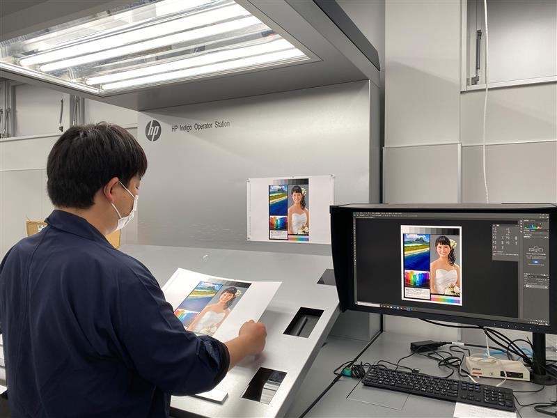
The print evaluation area at Asukabook Japan.
So how does the lab evaluate their printing and create prints that they know will always look the same to the end-viewer? They can’t. At best they can do a blessing dance, sprinkle some magic dust on them, and pray that the receiver of the print also uses a color-correct, industry standard viewing booth. Yah, right.
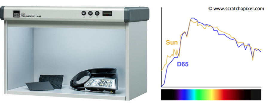
Above: A decent consumer color-balanced viewing booth can start at about $1000. This one is from B&H Photo. D65 closely models Sunlight in color representation.
The bottom line is that our labs have to use some kind of industry standard to evaluate the quality of their printing, however, us end-users rarely view our prints and albums under the exact same conditions, so we may perceive them as off-color, or too dark. Occassionaly they appear too light, but this is rarely the case as most end-users are using indoor lighting to review and evaluate their products, which is less bright, and warmer, than the D50 or D65 conditions that labs are using.
What can you do? Before condemning your printed product as too dark, or off-color, evaluate it in the closest thing you can find to midday, neutral daylight. If you have a diffused (un-tinted) window that gets some direct sun, bring it nearby and take a look. Viewing it outside under midday sun on a cloudless day would be ideal, but the specular reflections can also be a challenge there. Diffused sun is best.
The other thing you can do, especially if you expect your clients to be viewing their product, like an album, in a typical living room or office, is to adjust your images to be slightly lighter than what looks correct on your calibrated computer monitor. Computer monitors, by their very nature, always make images look brighter and more vivid than they do when printed. This album might look a little light if viewed under D50 or D65 lighting, but would look quite normal at home, under indoor lighting.
Asukabook Tutorial - lightening the shadows in Photoshop from Kevin Kubota on Vimeo.
Download the Photoshop Shadow Lightener action HERE. Once downloaded, simply double-click on the action file labeled Asukabook Shadow Lightener.atn to load into your Photoshop's Actions palette.
Wall prints, which may be displayed on a wall next to a window, or receive purposeful illumination, are not always in need of extra brightening. Albums, on the other hand, are typically enjoyed on a couch in the living room, on a dining table, or in an office, so will be viewed under much lower illumination.
Photographic printing is an exercise in compromise. We can never fully anticipate how and where our images will be viewed by our customers, so the “perfect” print rarely exists. An album that looks “spot on” when leaving the lab can look absolutely dreary when the recipient brings it to the restaurant to share with their loved ones over a candle-lit dinner.
At Asukabook, our lab in Japan is an industry leader in color management. They have hired the best color management experts in the country to help them develop and calibrate their equipment and workflow. They re-calibrate their printing presses hourly, as opposed to daily or weekly, like most average labs. In fact, at one point the printing press manufacturer, HP, would ask Asukabook to print sample products for them to display at their world-wide printing press trade shows! We are serious about color accuracy, and have spent many years fine-tuning a product that we, and YOU, can be proud of!